Notes from Workshop 1
|
We started by reviewing a bunch of NorCal jerseys to look
for things we like and things we don’t like.
That turned out to be a very interesting and instructive place to start. We classified them into 5 categories from least favorite to best.
|
Principles
|
In the process of reviewing all the jersey pictures, we pulled a bunch of principles out. I wrote them up in this PDF. Our jersey design will be based on these principles, so if you disagree with them or want to add some, let us know.
|
| ||||||
Jersey Concepts
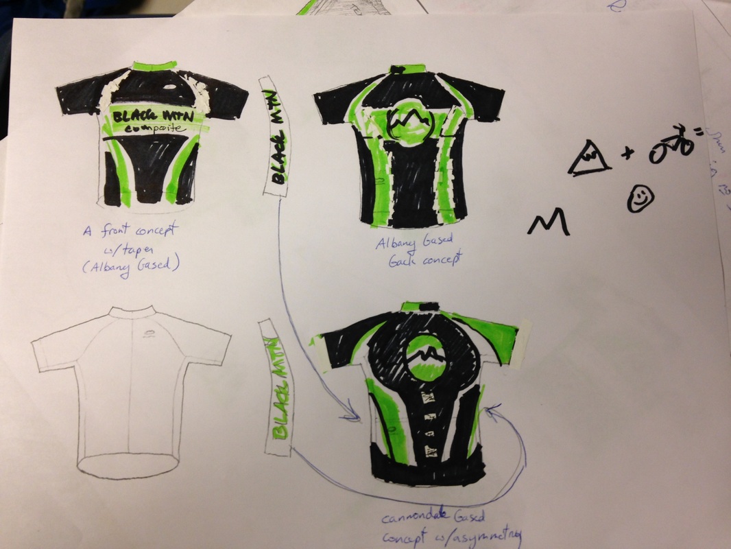
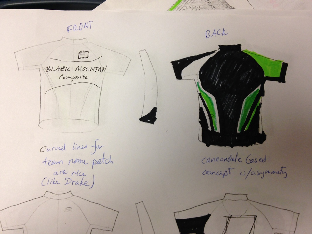
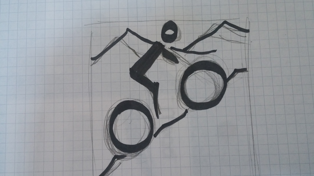
Next, we sketched up a couple of rough jersey concepts. we really ran out of time here, so we don't have a lot to show. this is just to give an idea of how high level of a concept we're working on at the moment.
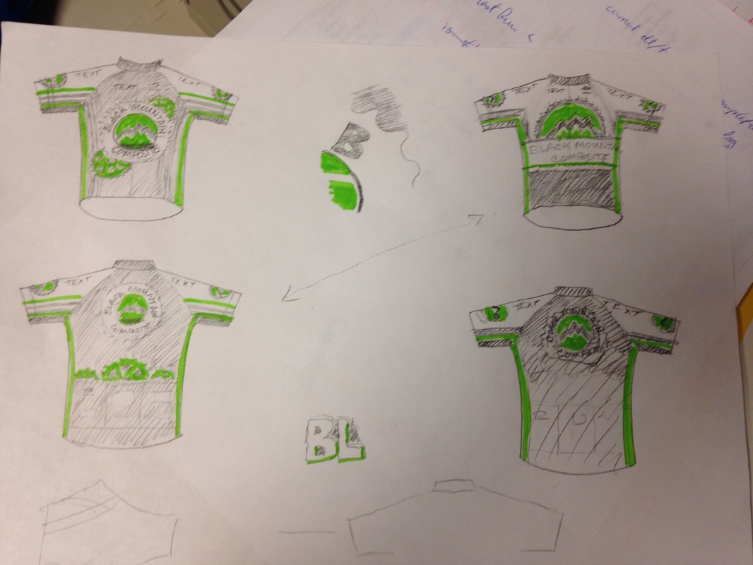
here is a much earlier concept that doesn't follow many of our principles but still has some interesting concepts at the logo and layout level.
|
If you want to sketch your own, you can download a template from jersey shops like Voler. (the templates are on the lower left on the page)
or you can print this pdf and use pen and ink for really fast rough concepts. |
| ||||||
Logo Concepts
When
thinking about the logo, we had a couple of ideas/examples thrown in for
consideration. We found ourselves
gravitating toward just a mountain, and keeping it more symbolic than literal. So lots of room for input or ideas here.
Fun Spot
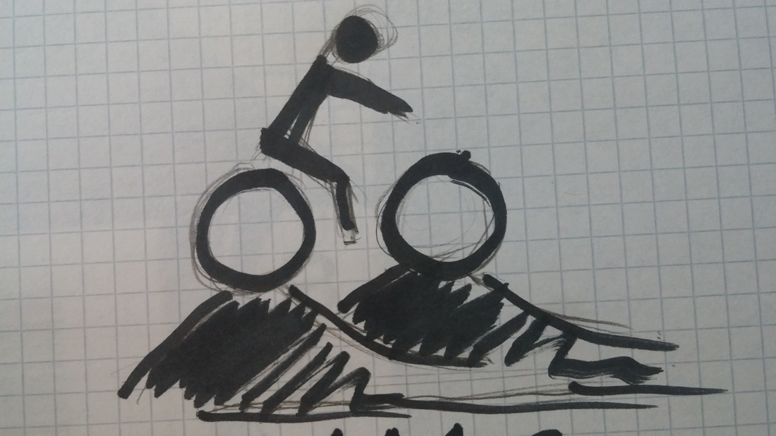
For a fun spot (a small marker somewhere that's not so serious), our favorite idea so far is something like
this drawing Josh did. We're thinking it would be fun to have on the collar with the mountain centered on the back. If we have a plain mountain logo, we could use our logo for the mountain. Any other ideas out there?
